Client: Liberty University, Professor. Hutchings (History of Graphic Design)
Work: Essay and Website Homepage Prototype (UI & UX) design Inspired by Jennifer Morla's 90s graphic design style
Firas Bachi © March 2022
Website Design
Essay & Inspiration
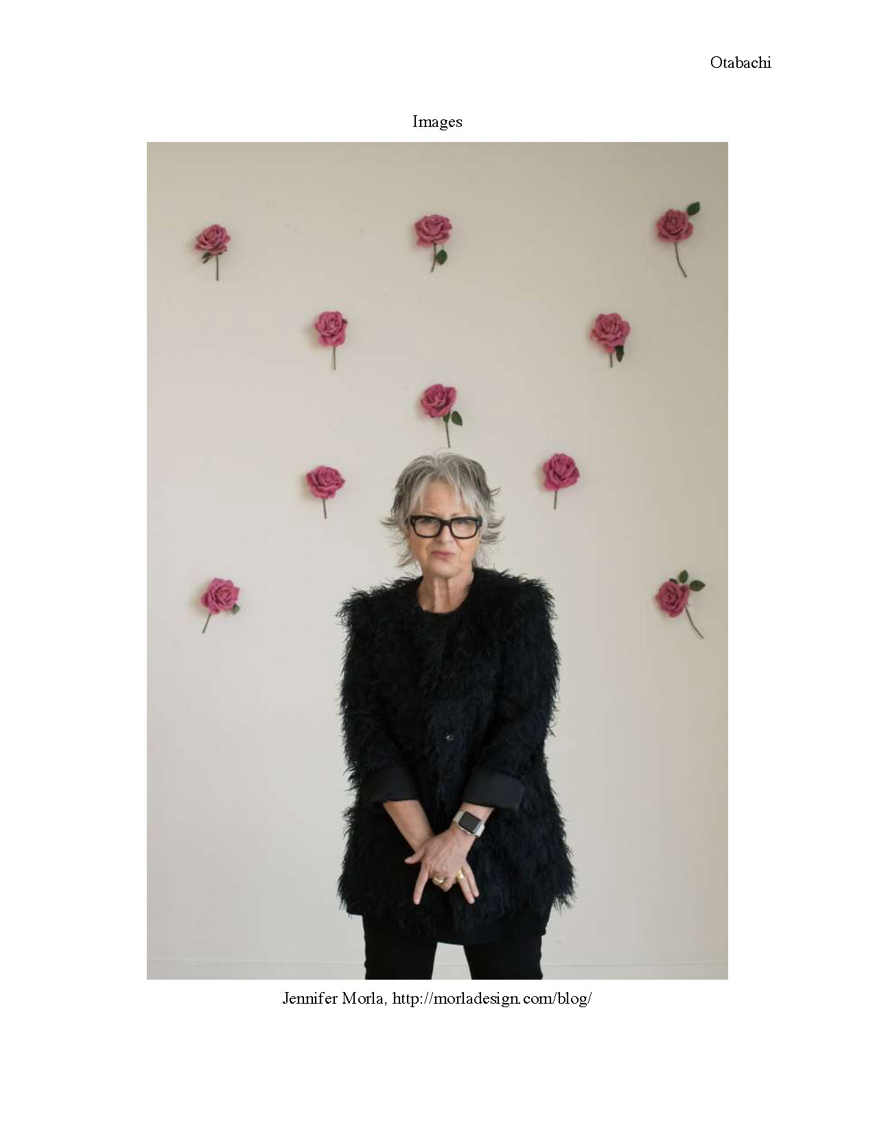
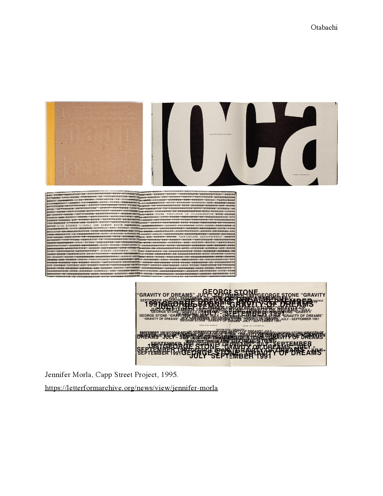
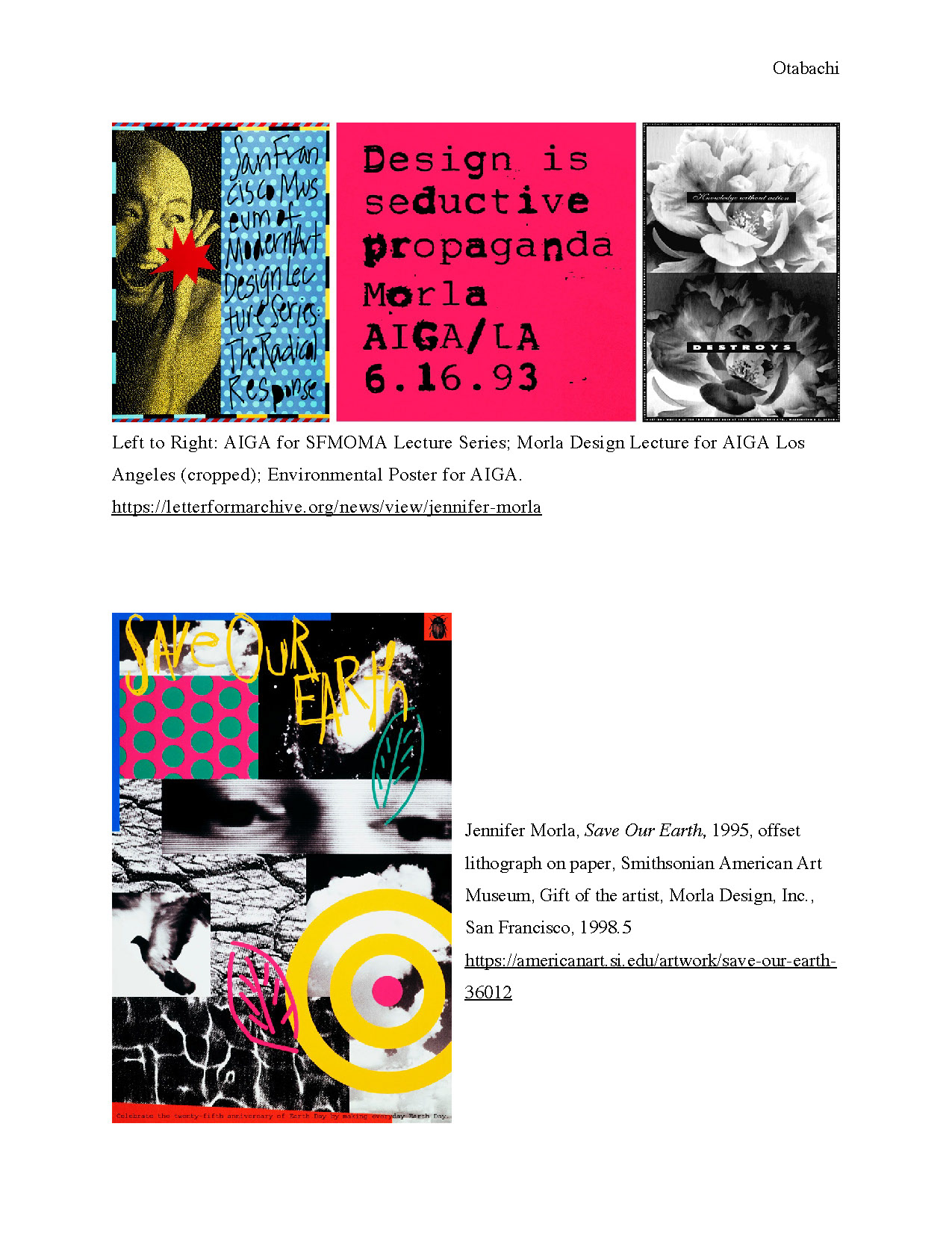
Jennifer Morla: Bold Beauty of Design
By Firas Otabachi
With polka-dot patterns, halftone images, large types, and high contrasting color palettes, she found the secret formula of boldness and harmony in design that captivated her target audience.
For almost half a decade of her career, Jennifer Morla (b. 1955) has "tapped into the hidden strengths of word and image". She wasn’t categorized with a particular style, she responds individually to the specific necessities of specific projects, yet her style is still distinctive and have an overarching look and feel, her mastering of using a combination of typography and photographs, solely or in very shocking contrast is a very common characteristic when you look at Morla’s work.
Morls has a unique relationship with typography, colors, images, and iconography. She’s been demonstrating a special talent for “converting traditional visual iconography into eclectic contemporary designs, in which imagery, type, and abstract forms are layered atop one other in various ways” as described on the Letterform Archive.
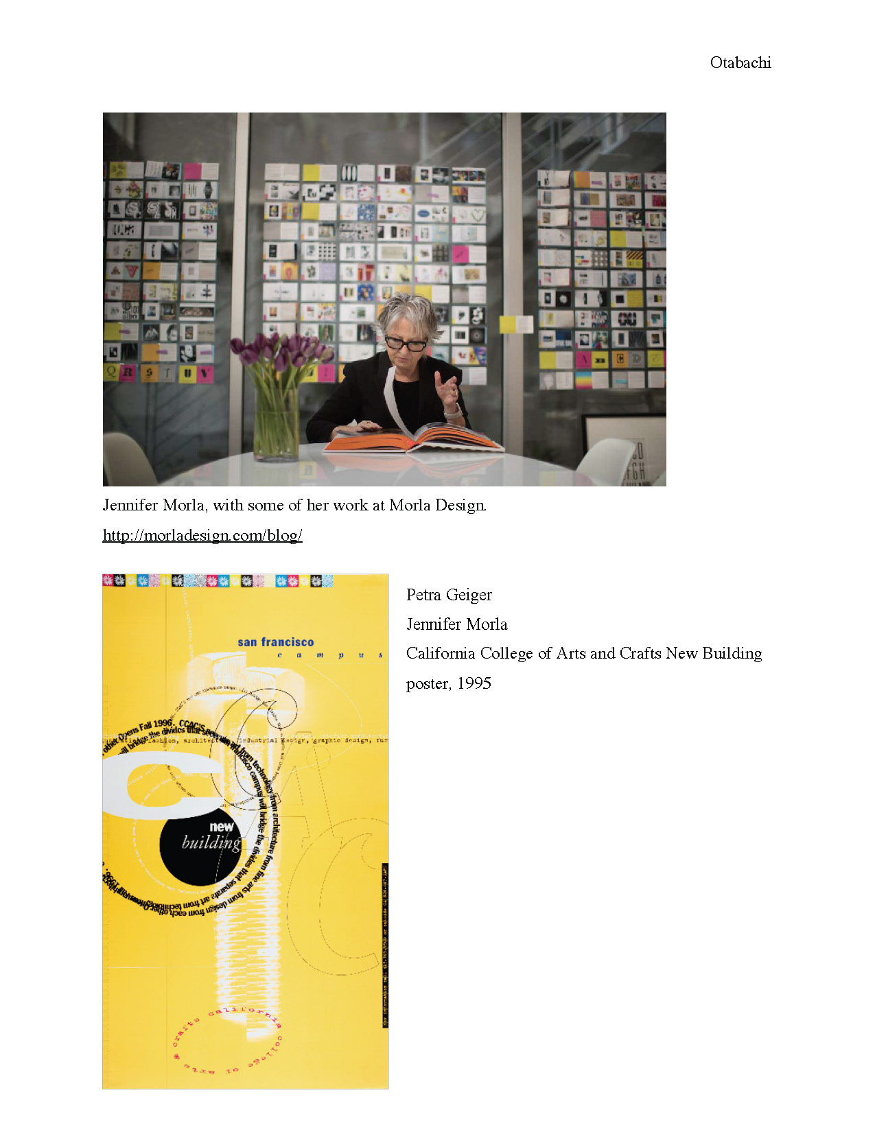
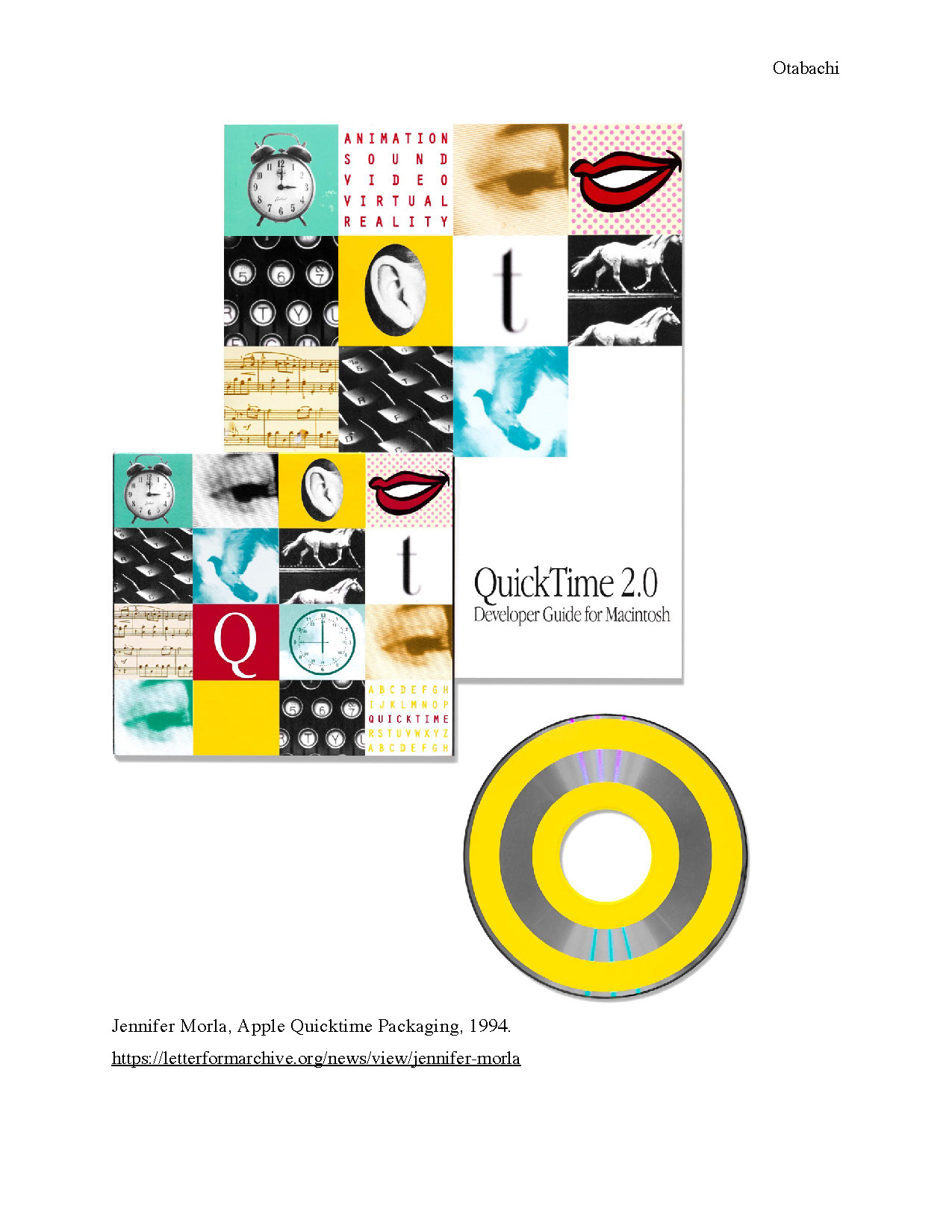
An AIGA Medalist, AGI Member, and National Design Award Recipient. Morla had a BFA degree in graphic design from the Massachusetts College of Art. She moved to San Francisco, LA in 1978 and worked for PBS/KQED as a designer. For many years she was the art director of Levi Strauss & Co. With her ability to challenge normality and invent new norms in design. She was able to reinvent the imagery of Levi’s American West. She established Morla Design, in 1984. A portfolio of high-profile clients included MTV Networks, Chronicle Books, Wells Fargo, Herman Miller, and AIGA. She teaches at the California College of the Arts and lectures internationally. Besides her own design studio. She also “assumed the position of chief marketing officer for Design Within Reach in 2006, she has exhibited widely and her work is part of the permanent collections of the Museum of Modern Art (New York), the San Francisco Museum of Modern Art, the Denver Art Museum, and the Library of Congress. ”.
Meggs wrote:
“Morla has engaged in all facets of design, including branding, print, packaging, motion graphics, environmental design, and typography. She has won over three hundred awards
of excellence and was admitted to the prestigious Alliance Graphique Internationale in 1998. She is known for her ability to combine wit and aesthetics with business pragmatics”
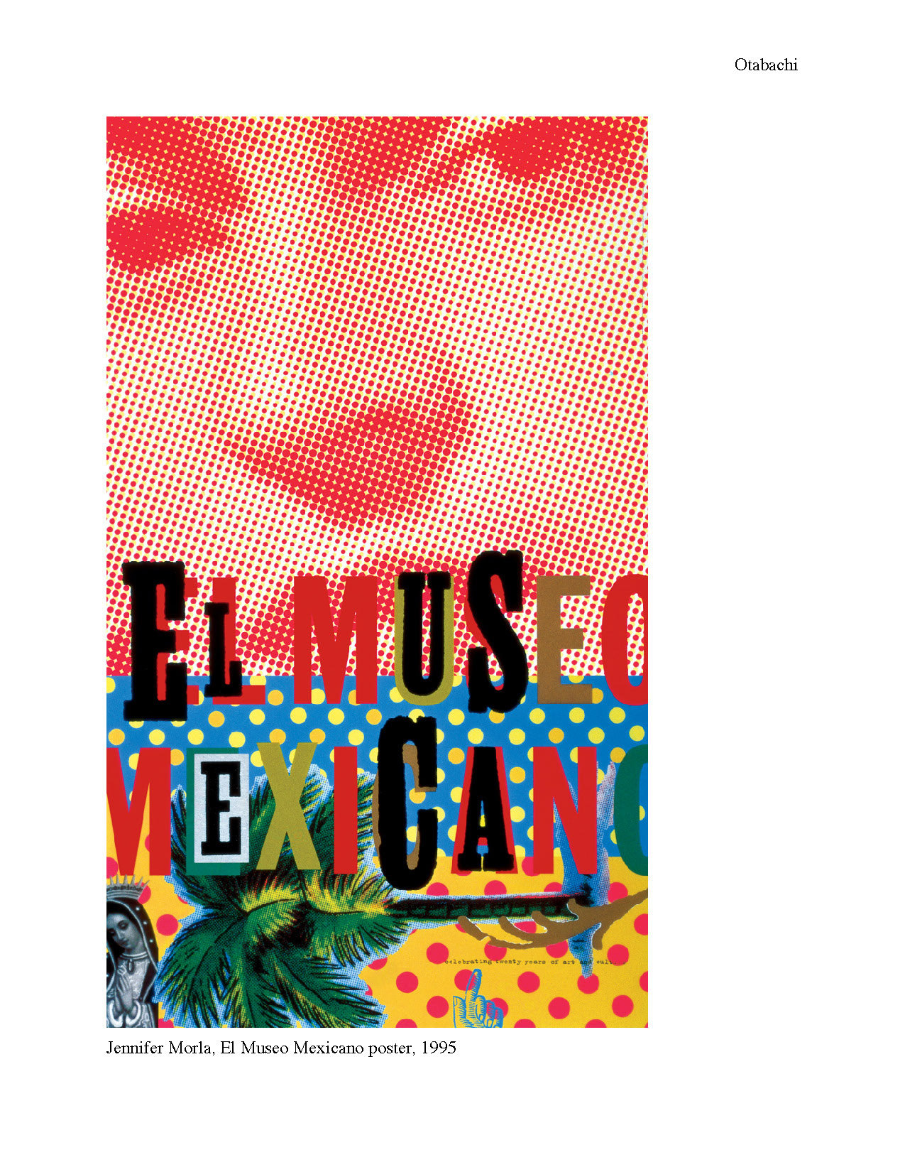
A winner designs that has been shown at a multitude of national and international museums that defined Morla’s style is her poster of El Museo Mexicano. On that poster illustrating the cultural representation in bold graphics, Sean Adams, chair of graduate and undergraduate graphic design at ArtCenter College of Design in Pasadena, California. An AIGA Medalist and former AIGA National President, contemplating and scrutinizing in a pursuit to find the secret aesthetics of Jennifer Morla’s El Museo Mexicano poster combination of key design elements and how Morla successfully, authentically and dynamically portrayed the Mexican culture in one visual and tackled the issue of representing women, he wrote on Design Observer:
“Morla used several elements on the El Museo Mexicano poster to create a message of vitality and excitement for the Mexican Museum. A large halftone dot pattern of Frida Kahlo’s face dominates the composition. Taken from a 1939 portrait by Nickolas Murray, the image connects the viewer with one of Mexico’s most renowned painters, while its treatment in halftone dots marries that tradition to reproduction and 20th century industry. It’s the way these elements play together that makes this poster so successful. The polka-dot pattern on the bottom of the poster references Mexican oilcloth used for bags and tablecloths and speaks to the domestic sphere, and echoes the Kahlo halftone dots. Meanwhile, Nuestra Señora de Guadalupe (Our Lady of Guadalupe), reproduced on the bottom left, connects the viewer to the religious life of Mexico by referencing the image enshrined in the Basílica de Nuestra Señora de Guadalupe in Mexico City. Additional motifs add a layered nuance to the poster. The palm tree, with a clear offset printed texture, connects the viewer to traditional Loteria cards. It also alludes to Mexican tourism as a nod to vintage postcards of the 1940s and 1950s. Finally, the vernacular typography alludes to handmade signs and graphic artifacts found in Mexican culture.”
With a timeless design style. Morla was able to manifest the bold beauty of graphic design fusing shocking colors with daring large iconography and choices of type, without losing the aesthetics of her human touch as an authentic artist.
Work Cited:
Meggs, Philip B, Alston W. Purvis, and Philip B. Meggs. Meggs' History of Graphic Design. , 2006. Print.
“This Just In: Jennifer Morla”, Letterform Archive, Jul 5, 2018
Adams, Sean, “Jennifer Morla: El Museo Mexicano, 1995”, Design Observer, 02.17.17 https://designobserver.com/feature/jennifer-morla/39512
“Jennifer Morla”, San Francisco Museum of Modern Art